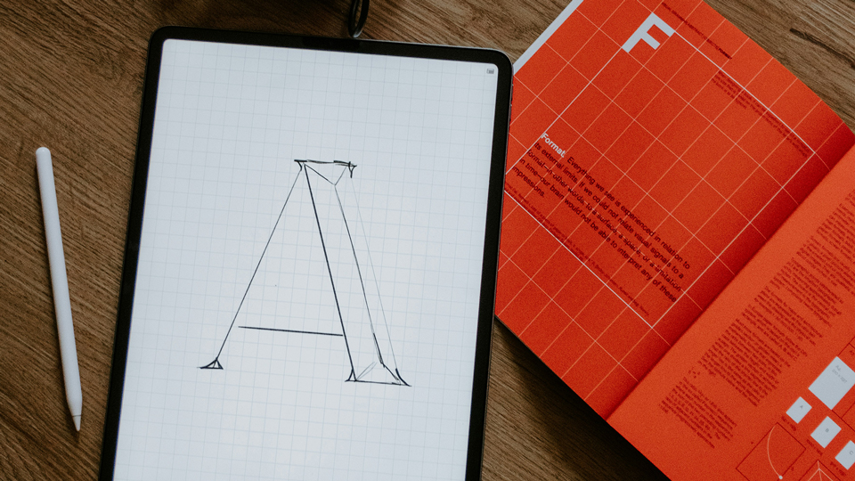
Have you ever looked at a design — a poster, a website, a piece of artwork — and felt instantly hooked?
That’s no accident. Behind every powerful visual experience lies a set of invisible rules: the Principles of Design.
If the Elements of Art are the building blocks, the Principles of Design are the blueprint — they show you how to arrange those blocks into something unforgettable.
Let’s unlock the secrets behind designs that don’t just look good — they feel right.
What Are the Principles of Design?
The Principles of Design guide how elements like line, color, and space come together to create a unified, visually pleasing result.
They aren’t stiff formulas; they are dynamic tools that help artists, marketers, and designers create work that connects deeply with audiences.
Here are the essential principles:
- Balance
- Contrast
- Emphasis
- Movement
- Proportion
- Rhythm
- Unity
Each principle serves a purpose — shaping how we see, feel, and respond to a piece of visual communication.
Exploring the Core Principles
1. Balance: Achieving Visual Stability
Balance is how visual weight is distributed. It can be symmetrical (formal and organized) or asymmetrical (dynamic and energetic).
Without balance, a design feels uncomfortable — too heavy on one side, too empty on another.
2. Contrast: Creating Interest and Focus
Contrast brings excitement. It’s the clash between light and dark, rough and smooth, big and small.
A strong contrast draws the eye and highlights what’s most important. In branding, contrast can separate a logo from a cluttered background — making it pop instantly.
3. Emphasis: Directing the Viewer’s Eye
Every design needs a hero. Emphasis creates a focal point that commands attention. Through color, size, texture, or placement, emphasis tells viewers, “Look here first.”
4. Movement: Guiding the Journey
Movement isn’t just physical — it’s visual flow. A designer uses movement to guide the viewer’s eyes through the artwork in a deliberate path, keeping them engaged from start to finish.
5. Proportion: Building Realism and Harmony
Proportion is all about the size relationships between parts of a whole. Accurate proportion feels natural; exaggerated proportion can create drama or surrealism, depending on your goal.
6. Rhythm: Creating Visual Beats
Rhythm uses repetition to create a sense of organized movement — like a beat in music. Whether it’s repeating shapes, lines, or colors, rhythm brings a feeling of continuity and energy.
7. Unity: Making It All Feel Connected
Unity is the invisible glue that makes everything work together. Even if your design is packed with contrast and movement, unity ensures it feels like one complete piece, not a chaotic mess.
Why These Principles Matter
Without the Principles of Design, even the most creative ideas can fall flat.
These principles are what separate good design from great design — the kind that:
- Grabs attention immediately
- Communicates messages clearly
- Leaves lasting impressions
Whether you’re designing a marketing campaign, creating digital art, developing a new brand identity, or crafting a simple Instagram post, applying these principles gives your work clarity, purpose, and power.
Final Takeaway: Design with Intention
The Principles of Design are not rigid rules meant to limit creativity — they are tools to amplify it.
Once you master them, you’re not just “making things look good” — you’re shaping how people feel when they see your work.
The best designers don’t just create visuals.
They create experiences.
Leave a Reply